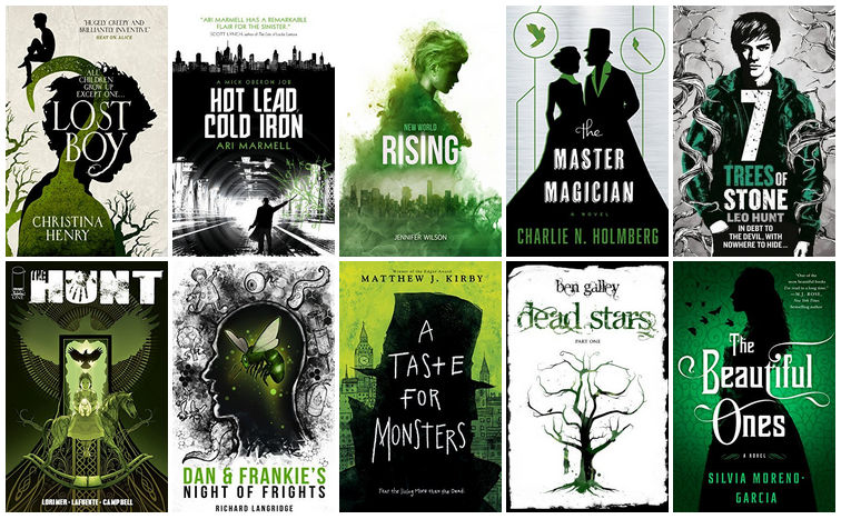
I’ve been doing these color themed cover posts every so often, and, you might not have noticed, but I’ve actually been doing them in order of the rainbow. I’ve already done red, orange, and yellow, so today we’ve reached green!
Green was significantly harder than I thought it’d be. I mean, it’s green! You’d think that wouldn’t be hard to find. I also ran into the issue of such varying shades of the color, which threatened to ruin my collage, but I managed 😉 So here are the covers!
Oftentimes I’ll love the artwork on a cover but won’t really like the whole design with the font and placement and everything, but I think all of these were designed really well!
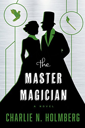
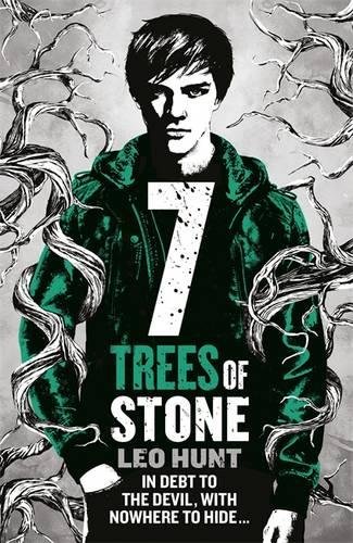
My favorite of this bunch is Lost Boy. This is the UK version of the cover, and I’m so jealous because it’s so artistic and gorgeous! Hot Lead, Cold Iron is eye-catching, and I love the look of the urban setting with the green magic. New World Rising is beautifully done with that smoky/powdery look. The Master Magician is simple but pretty, and I like how the covers for that series match their stories (it’s the only one this list that I’ve read so far, although there are some others here that I want to read). Seven Trees of Stone looks very cool with the branches twining around and the intense look of the character (though unfortunately that cover has been changed since I put this post together).
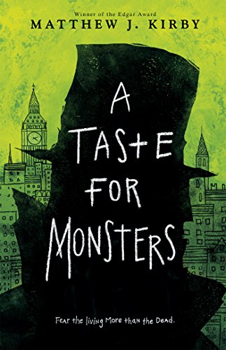
The Hunt has a very eerie feel with some nice artwork. Dan & Frankie’s is interesting, especially when you look closer and realize there are little drawings in the smoke. A Taste for Monsters has this fantastic surreal illustrated look to it. Dead Stars is simple but creepy and stands out. The Beautiful Ones is also simple, but a nice use of silhouette to make a pretty cover.
Overall it’s a great batch!


I really love these covers! I think The Lost Boy, Dan & Frankie’s…, & The Paper Magician are my favorite of the bunch. I adore the overall art on The Lost Boy and The Paper Magician, but the colors on Dan & Frankie’s give a nice, but chilling effect of creepiness.
I think Lost Boy is my fave too. And I’ve always loved all the Paper Magician covers. Yeah, the one shade of green has a kind of creepy, radioactive vibe.
This is a pretty good color combo. 🙂 You did a great job matching these up! My favorite is The Beautiful Ones- I love the green and black silhouette. Awesome. And Lost Boy and Dead Stars are cool too.
Hot Lead Cold Iron I like because it’s like he’s underneath the city, and I like the green magic as well. 🙂
I figured you would like it 😛 Silhouettes are great! I think Lost Boy is my fave. I do love the city aspect of Hot Lead, Cold Iron and the green magic!
Huh, I did not know there were so many black, white and green covers. I do love that cover of Lost Boy. I am noticing a theme with these covers, there a whole heap of silhouettes. I agree with you about The Master Magician, I always liked how all the covers matched for the series and they are so pretty and simple. I think A Taste For Monsters might be my favourite from these, but I do love The Beautiful Ones cover too.
It is such a great over! And oh, huh, you’re right lol. I guess it’s hard not to do silhouettes when you only have three colors to choose from lol. A Taste for Monster is so whimsical, I love it!
I love green (and actually decorate with it a lot) and the mix of green/black/white that you used is gorgeous.
Green is a great color!
These are gorgeous! I love when you do these color collages, it just makes me happy. I love The Lost Boy cover too, why is it I often love UK covers more than US ones?
The color-based ones just look so great, I love them too lol. I think Lost Boy is my favorite. And seriously, why do they always get the better covers???
These covers are so pretty. The covers of The Master Magician and The Beautiful Ones are so pretty. *.*
Those are such pretty ones!
I feel like green would be a hard one for me to find covers for! I’m reading Lost Boy right now but the cover is very different.
Ooh you’re reading it? I really want to read that one. I honestly hate the US cover though lol, so I’m to get the UK one from BookDepository at some point.
I didn’t realize you were doing these in the order of the rainbow, how fun! I actually remember a few covers with green that I read, some cozie mystery series tend to use a different color on each cover, so my favorite series in that genre often have a green cover somewhere along the series. Although I never was sure if I could find enough green cover to fill a post with, I always wanted to do a green color cover post as I love green.
I like the ones you picked for this post, there’s quite a bit of variation in the exact green tint, but it still makes a pretty whole to see them all next to each other. I like the smokey look of new world rising. And Lost Boy is well done too.
Since I started with red, it just seemed like a good plan lol. You should totally do a green covers post! Green is a nice color. And I love when series do that, where each book is a different color.
I really do love that smoky look, but I think Lost Boy is my fave!
Dead Stars catches my eye!
It’s an interesting one!
I know you specifically picked the Hunt’s cover as eerie, but honestly all of these have a touch of eerieness about them for me, and that is something I never thought I’d say about the colour green on a cover.
I guess green *is* kind of an eerie color, in some ways. Which is weird since it’s also the most nature-y lol.
I’m loving The Beautiful Ones. There’s something about that silhouette and the emerald green that is just so striking to me.
It is a really nice one, and it’s a great shade of green.
I love this color combination. It really makes for a striking cover with that pop of green.
Color pops are so pretty!
I had no idea there were so many covers with green, black, and white! Lost Boy is my favorite but I kinda like them all. 🙂
Lost Boy is just so pretty, but all of them are definitely great!
I love these. I like the one that sounds like Peter Pan.
It’s about Hook, so you’re close!
oh a rainbow feature! Love that idea! I love green so I really like today’s edition 🙂 oh I’m checking out because I really liked Certain Dark Things. And that cover reminds me of Beautiful Creatures! I gotta say my fav is Lots Boys 🙂 which reminds me of Blue Lily book 3 of the Raven Boys, which I haven’t been able to get through ever LOL so I’m obsessed with it because… yeah… that’s how my brain works! LOL
Apparently lots of people love green lol. I think Lost Boy is my fave too! Some of those Raven Boys covers are gorgeous. I think I have one in my upcoming blue post, haha.
Such a pleasing aesthetic. This is one of my favorite color combo and I think you’ve done a great job here. Plus you managed to add some new ones to my wishlist. Of course I knew you would! I hope you are having a great new year!
Seriously, these color-based ones make such nice collages lol. Always happy to enable a fellow book blogger by adding to their tbr 😉 Thanks, you too!
I love all of these covers because my favorite color is green. Dan and Frankie is my absolute favorite though.
Tori @ In Tori Lex
It’s always the best combo when it’s your favorite color! That cover is a great one.
Rising is the first one that caught my eye, but that could be just because it is top center 😀 I love the collage and all the covers are super pretty <3 I am also surprised green was difficult but now that you mention it, I can't name any green covers haha.
Lol now I wonder if my placement is subtly affecting people’s opinions. That is a really unique one though!
Lost Boy drew my attention immediately, but I also gravitated to The Beautiful Ones, because bloggers have raved about that book.
I love the Lost Boys one! Lots of people seem to love the cover for The Beautiful Ones as well!
Wow, this post actually stole my breath a little. Only when I see it like this did I remember how much I actually absolutely love my green covers and books. I LOVED New World Rising and I really need to read book two. I also need to read the next book in the Paper Magician series too, as you know I liked the first one a lot ^.^
These color-based posts make for great collages! Green is a great color. I haven’t read that one, but I might have to, for the cover if nothing else, haha.
I love that these are toning greens with silhouettes too. It’s such a strong collection all together 🙂
They’re all so pretty, and the silhouettes do like nice together!
I love B&W with a pop of color but this combo isn’t a favorite. But I do love The Lost Boy. I think it’s because it’s more artistic and has a softer cream rather than white.
Karen @ For What It’s Worth
Aww, that’s too bad the green isn’t working for you! That damn cream color nearly ruined my collage, haha.