I love covers that are black and white with just one true color because it really makes that one color POP. And even though these covers can be enjoyed year-round, what better to time to share some awesome black, white, and orange book covers than October? No better time, I think. So here some great, orange-filled book covers!
Cover Characteristics is a weekly meme hosted at Sugar & Snark. I went rogue this week, so my topic is:
Black, White, & Orange Book Covers
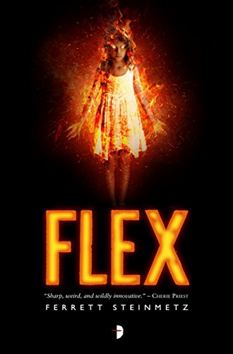
Fire Dancer is my favorite because WOW, look at how beautiful and bold and striking it is! Flex also uses fire and the black/orange contrast to create a bold, interesting look. Magicians Impossible only uses orange in the text, and it’s somewhat of a simple cover, but I like the effect it has, and the smoky person shape is cool. I’m not sure exactly what’s going on on the Ash and Quill cover, but it looks beautiful and uses all three colors really well. City of Crows, The Final Descent, Golden Bulls, and Hallow Point all use silhouette in a nice way and are very eye-catching. I really love the contrast and the artwork and how the text really builds onto the look on The Shadow of What was Lost (I love all the covers in that series). And Flicker has that nice, eerie double-exposure effect.


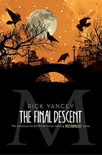

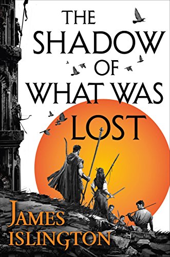



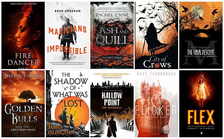

I love it when covers sorta reflect the season? My favorites here would be City of Crows (looks spooky), The Final Descent (same), and The Shadow of What Was Lost (which looks like epic fantasy, but I like the orange moon or sun or whatever it is). Nice picks. I think I have a thing for silhouettes against stark tree branches, and the whole birds thing and a full moon. I seem to gravitate towards those.
I’ve just been planning to do more posts with black, white, _______ covers, so this was the perfect motivation to get to it lol. Both of those do look spooky. And I just love the covers for that whole series of Shadow of What was Lost (they’re all similarly designed), I don’t even know how to explain why I love them, but I do!
I love how similar coloured covers look grouped together like this 🙂 I think my favourites out of these are City of Crows and The Final Descent (I like crows/ravens/birds).
Seriously, they look amazing all grouped together! I love these color based posts for the same reason, haha. Birds do tend to look great on covers!
I like Golden Bulls and City of Crows the best. Not really a fan of Flex, Flicker or Fire Dancer due to emphasis on a face or body. I prefer scenic or silhouettes!
I like faces/bodies depending on how they’re used, if they’re illustrated or photographed, etc. But the silhouettes are great too!
They had a fall cover theme for TTT a few weeks ago and I was surprised by how many brown/orange covers there were and how beautiful they are.
For What It’s Worth
Yeah I’m usually not a big fan of orange, but sometimes it looks great!
City of Crows is captivating. All these books in a big old pile with some fall leaves would make a fabulous fall display.
If only I had instagram… or leaves that changed color lol.
I can send you some. My yard is smorgasbord of color and they are a PIA to clean up!
Lol that’s ok, we still have piles of branches and whatnot along the sides of the roads from the hurricane, and I saw a meme online about how that’s our fall color down here, so I’m good 😛
Oh this is a combination you don’t see that often but looking at these covers, they totally need to be used more often because all of these are so gorgeous!
Right? It’s not one you see often, but it turns out it looks great!
I didn’t think I liked the colour orange but looking at these book covers I may have to change my mind on that. These are such cool covers, and the black and white probably helps with that. Fire Dancer is so pretty but I think Flex or Flicker may be my favourites… or The Shadow of What Was Lost.
I didn’t think I liked orange much either lol. But lately I have come to realize that all the colors are actually beautiful! So it turns out orange is beautiful too when it’s used with just black and white 😀 I love The Shadow of What was Lost so much, I don’t even quite know why.
The Magicians Impossible is an incredible cover Kristen…. actually this Is an incredible lot of orange books… have you read all of them…? The Shadow of What was Lost looks up my alley… ♥️ I did not know about this meme I’ll have to check it out!
I didn’t realize there were so many orange books either until I started looking! But no, I have only read one of them lol (Flex). I’d like to read some of these other ones though!
My favourite individual cover has to be Ash and Quill, but don’t they look absolutely brilliant together? Thank you!
That’s a great one, but yes, they look even better when they’re all grouped together!
Wow! These are some stunning covers! I love the color combinations. I think Ash and Quill and City of Crows are my favs. I like the use of the crows in The Final Descent though. And I really like Golden Bulls too…I like sunsets. 🙂
They just look so great when they’re all together! Makes already gorgeous covers look even more gorgeous lol. Ash and Quill and City of Crows seem to be everyone’s favorites, and those are def great ones. The sunset in Golden Bulls is super pretty too!
they are all awesome as usual! So hard to pick but I guess Ash and Quill and City of Crows it is!
Of course they’re awesome, I always find awesome covers 😉 Those are definitely some gorgeous ones!
update: you had always had the best covers! And then… well… Loki happened ???
Just for that, I AM going to hang that cover in our living room!
I do like how Magicians Impossible has just the title in orange – it works. I do think black and with just ONE other color is a cool look.
Yeah, it really does work! And black and white with one other color seems to always look good.
I like looking at them all together like that. I’m partial to Ash &Quill. Haven’t read it, but the cover is cool.
Right? I love just looking at the collages for these color-based ones lol. I agree, that one’s a gorgeous cover!
I love orange and black covers, they look so… October no matter the time of year. Lovely choices
Lol yeah orange and black always makes me think of HAlloween!
I like the City of Crows cover the best. The atmosphere is what captures my attention, maybe because of the silhouette. Great post!
That’s definitely a great one, silhouettes make for nice covers! Thanks!
Ohhh damn!! These are SO PRETTY!! I really want to read the Ash and Quill or Paper and Fire or whatever it is called Series! I’ve heard so many great things about it!
You managed to make all of these fit flawlessly together and it looks amazing! Beautiful post!
I haven’t heard that much about it, but it does sound interesting! Thanks!
I love the color combinations on these covers. It’s all so aesthetically pleasing. It may have something to do with Halloween, but I don’t know… I just think the covers are all so striking and wonderful.
I agree, I love how they look when they’re all together like this. And the black and orange definitely gives a Halloween feel!
These look so pretty all next to each other where all you see are those three colors. I agree that the Fire Dancer cover is very pretty! I like how simple it is with few elements, but very striking.
I love how they look all together like that too! No one else has liked the Fire Dancer cover so far lol, I’m glad someone agrees with me!
It’s The City of Crows and Hallow Point that drew my attention first. I agree, the black and white combo with a pop of a singular cover is an awesome cover technique, I’d loves to see covers done like this with different covers, especially cool tones like blue, purple and green. Such an enjoyable collage!
Those are great ones! And don’t worry, I’ve got posts planned for all the colors 😉
Wow, you found a lot! I love the cover of Ink and Quill. ☺
That one is gorgeous!
Oooh I LOVE this! I had no idea there were so many perfectly Halloween-y book covers, these are fabulous. I like Fire Dancer and The Final Descent the best! Though I don’t actually dislike any of them, so I guess that is a definite win! With Ash &Quill, it kind of looks like the library has burned down, perhaps? Which is sad. But you’re right about the colors working together well! Fun post 😀
Yay someone else who likes Fire Dancer! But I agree, I don’t dislike any of them, so it was hard choosing a favorite. Hmmm, maybe you’re right about Ash and Quill. But it’s still gorgeous regardless of what’s going on, haha. Thanks!
Very pretty color collection. I didn’t realize until thinking of it how well orange, black and white went together. I was going to make some more homemade soap this weekend and just realized that would be a great mixture for a halloween soap with swirls.
Think my favorite of the covers you displayed is City of Crows and Fire Dancer
Thanks! It’s amazing how great any color can look when combined with just black and white lol. That would be a perfect combo for Halloween soap!
I like those too!